The story hidden in the cover : Northern Wrath
- Dec 14, 2022
- 5 min read
I'm here today to gush about the cover of my debut novel, Northern Wrath. I'll tell you all about how even the smallest and seemingly unimportant details match the contents of the book precisely!
I will be talking both about the story and about how the cover reflects it, so there will be spoilers ahead!
The Axe

Let's start with the most notable part of this cover.
For those of you who have read the book, you will recognise this axe as Hilda's Ulfberht axe. My great editor, David Moore, was the one who came up with the idea to have Hilda’s axe on the front cover and he contacted the brilliant artist Larry Rostant to bring it to life.
This axe is crucial to the story of Northern Wrath.
In fact, chapter 19 is all about this axe. It represents a new beginning for Hilda as a raider and the start of her journey beyond Midgard. This first book is very much Hilda's story. She is the main driving force, even the decisions made by Einer, another main character, relate back to Hilda.
It was therefore fitting that the cover of the first book should represent her at her strongest.
Here's a fun fact, on the original cover, the carving on the axe looked different. Here's a side by side comparison.


This first version of the cover was revealed last year as an exclusive on Sue’s Musings (give Sue a visit, she does brilliant reviews)!
As you can see, at the time, the engraved image was only on the tip of the axe, which is indeed how axes are mostly engraved nowadays, but in the Viking Age there were exceptions to this.

To be able to have an engraving covering the entirety of the axe without the weapon losing integrity was the mark of a great smith. It's something you can see on the famous Mammen Axe (see photo).
Since we actually see the Ulfberht axe get smithed in the story and the skill of the smith is an important detail, it was crucial to me that the engraving match the book. That's why the cover was updated and adapted and if it was cool before, I think it's absolutely stunning afterwards.
It may be a minor detail but as a reader I love it when covers and descriptions in books are exact matches, not just kind of, but exactly how they’re described. That way the cover and manuscript don’t feel like two separate pieces that work together but like two halves of the same experience.
When I saw the first draft of the cover, I had another slight concern about the axe. My first worry was the engraving, which we covered above, the second was that the shape of the axe was from an earlier time period than the one I was writing in.

In the period my story is set, the type of evenly balanced axe like the one shown here (sold by Wulflund) were much more fashionable. Long bearded ones as the one on my cover were outdated and of a time past. The longer the beard (the extended lower part of the axe-head) the more out of fashion it was, but...
The bearded axe looked SO much more dynamic on the cover, and as I stared at it, I began to see how it would be cool if Hilda's axe was of an older design.
The axe would seem even more magical to my characters if it was a newly forged axe in the old style, and so, I wrote that into the story with a few details sprinkled throughout the narrative. I think it's a detail that really ties a pretty bow on this part of the story.
The cover actually ended up changing and improving the words within the story! Isn't that cool?
Fire and Ashes
Let's talk about the motifs chosen for this cover. Each book in the trilogy has its own set of unique motifs that perfectly match the themes in the book. For Northern Wrath the main motif was fire and ashes.
For anyone who has read the book, you'll know how this truly encompasses the story. The town of the villagers is called Ash-Hill. And there are ashes in Ash-hill, and fire. Hilda too is, in a sense, forged in fire, as is the the axe which is the main feature of the cover.
A detail that I personally love are the blackened carvings that you can see in the background. They truly look like intricately carved pieces of wood that have been burned and scorched, in the exact way as so much of Ash-Hill was.
The Runes

By Runes, I'm talking about the swirling pattern in red and yellow that arrives from the bottom left corner of the cover. To me there's a sort of magic to the way they weave into the picture and as soon as I saw them on the cover, I thought that they seemed to represent the Runes.
The truth goes even deeper though.
The artwork used for this representation of Runes is also used inside the book at the top corner of the chapter headers.
The art is not only beautiful, it is real Viking Age art, made once upon a time by a real Norseman.
And this artwork has a hidden meaning, which brings us to...
The Ship
"What ship?" asks the reader who has not yet read the book. And to you, dear reader, this is your final warning: there will be spoilers ahead! For real now! I suggest that you look away and come back once you’ve devoured the book.
To those of you who are still here, let's get into it.
Not only does the title ‘Northern Wrath’ describe exactly what is happening in the book, as our Vikings of the far north sure let their wrath carry them through this tale… it is also the name of a ship in the book.
One of our main characters, Einer, owns the ship Northern Wrath. Well… that detail made it into the design of the cover!! Isn’t that awesome?
Because... the Runes on the cover (the same artwork that's also on the chapter headers) was originally found on a ship!


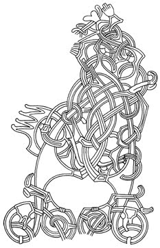


It is a tracing of the animal head that belongs to the famous Oseberg ship burial and so could not have been a more appropriate for the book Northern Wrath, which was named both after a plot point and after a ship that plays a central role in the story!
Spoiler for end of Northern Wrath:
At the end of this book, Northern Wrath gets ruined and is set aflame as a funerary ship. It’s a motif that accurately portrays the themes in the book. The wrath of the northern characters is fuelled by southerners and burns out in the end.
Even more symbolic is the fact that Hilda is aboard the ship, in the end. Exactly as portrayed on this front cover. Ship, Hilda’s axe, Runes, ashes and fire.
This is why I think it is the perfect cover for this story. The more you look at it, even the smallest and seemingly most insignificant of details directly relates to the story and to the main themes of the book.
In conclusion, this front cover does not just look epic, it perfectly encompasses everything this story is about!
All three covers of the HANGED GOD TRILOGY were made by the brilliant Larry Rostant. I highly suggest having a look at his site and I guarantee he has made a few covers that you’ve seen around and about.
"The story hidden in the cover : Shackled Fates" coming soon...
Comments